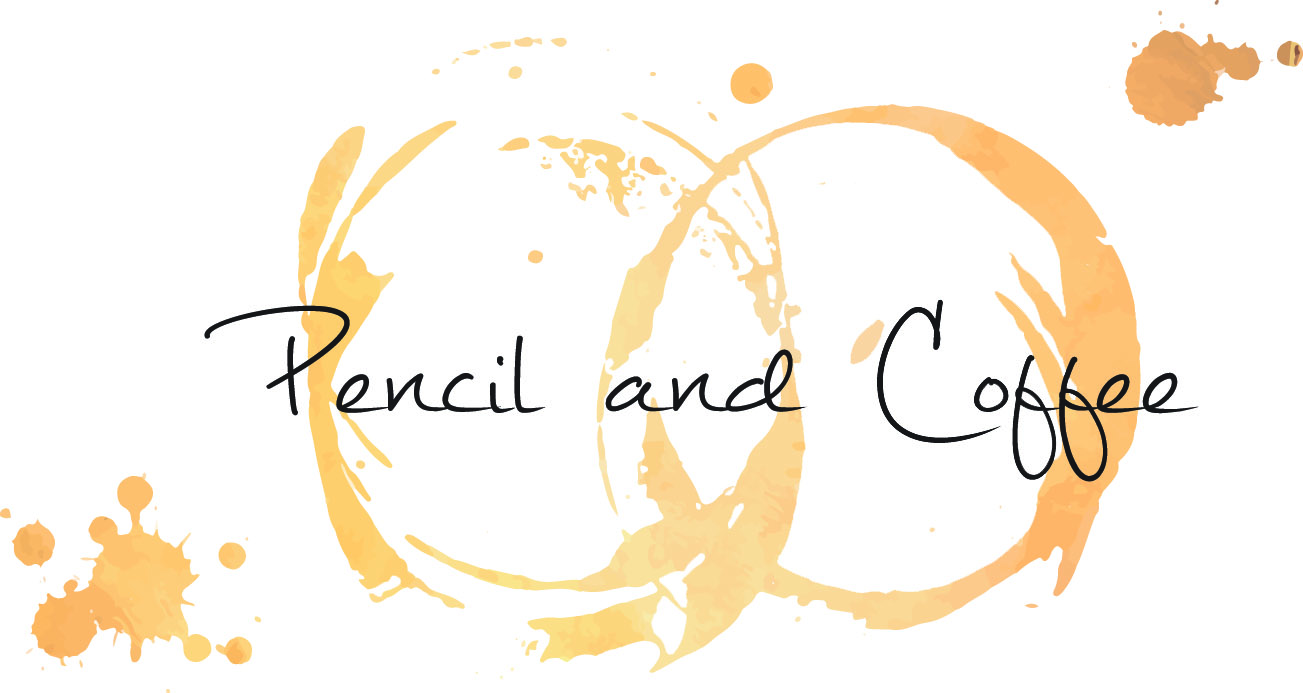
A company name is something that is unique to the company and represents the companies personality. We wanted to create a name that was both fun and quirky, representing our personality across to our clients.
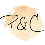
A logo is something which represents the ethos of your company not necessarily what your company does, that can be found out by visiting your website or speaking to you directly.
When we came up with our logo we wanted it to represent the future which is why it is designed to look like an app, to show we want to grow and develop into a company which can produce design that go along and keep up with the latest technology. The coffee and the pencil obviously represent the name of the name of the company, which makes it distinguishable without the text being there. The colour scheme and the rest of the design is to show that we are fun, quirky and creative individuals who want to produce the best work for clients.
And not to forget a pencil and coffee are the essential ingredients needed before any design work is done by us!
Here are some images of what are logo looked like before, until we came up with one which we were happy to show off to the world!
![]()

I came to your What’s in our name – Pencil and Coffee – Pencil and Coffee page and noticed you could have a lot more traffic. I have found that the key to running a website is making sure the visitors you are getting are interested in your subject matter. We can send you targeted traffic and we let you try it for free. Get over 1,000 targeted visitors per day to your website. Start your free trial: http://0nulu.com/rjv Unsubscribe here: http://0nulu.com/mvx